Animated MCMC with Matplotlib
This blog was generated from a working notebook that is available here.
1. Write down an interesting distribution
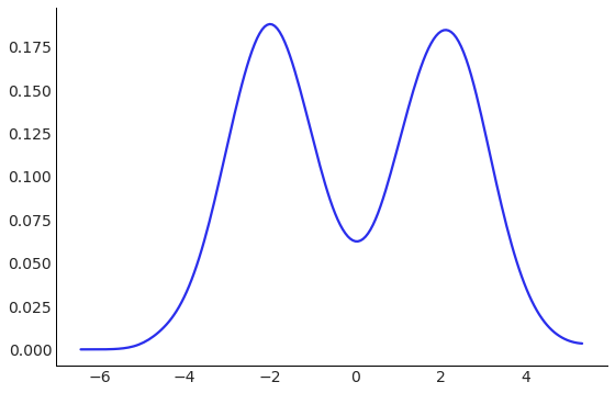
A mixture of Gaussians is different from a sum of Gaussians, in that it is not Gaussian itself, but it is visually interesting, can be difficult to generate independent samples from, and knows many secrets.
Here is an implementation that mostly follows the API of scipy.stats in that it provides a .pdf method for the probability density function, and a .rvs function to provide random samples. If the rvs function looks a little complicated, it is because shapes can be hard in high dimensions, ok?
We can use the .rvs method to view the density of this distribution.
class MixtureOfGaussians:
    """Two standard normal distributions, centered at +2 and -2."""
    def __init__(self):
        self.components = [st.norm(-2, 1), st.norm(2, 1)]
        self.weights = np.array([0.5, 0.5])

    def pdf(self, x):
        return self.weights.dot([component.pdf(x) for component in self.components])

    def rvs(self, size=1):
        idxs = np.random.randint(0, 2, size=size)
        result = np.empty(size)
        for idx, component in enumerate(self.components):
            spots, = np.where(idxs==idx)
            result[spots] = component.rvs(size=spots.shape[0])
        return result

az.plot_kde(MixtureOfGaussians().rvs(10_000), figsize=FIGSIZE);
2. Write down MCMC
There are a few software libraries for doing this sort of thing [1][2][3][4][5][6][7], but we can use 8 stripped down lines.
You should look up the Metropolis algorithm if you are not familiar! It is beautiful and important. Also, don’t use it.
In general, this lets you generate draws from a probability distribution, given access to the probability density function. So we will pretend we did not implement .rvs above, and generate samples using only the .pdf method.
def metropolis_sample(pdf, *, steps, step_size, init=0.):
    """Metropolis sampler with a normal proposal."""
    point = init
    samples = []
    for _ in range(steps):
        proposed = st.norm(point, step_size).rvs()
        if np.random.rand() < pdf(proposed) / pdf(point):
            point = proposed
        samples.append(point)
    return np.array(samples)
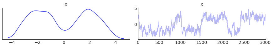
3. Find a visually pleasing set of draws
This is more art that science, but the animation looks nice if the draws:
- Are correlated
- Switch between modes pretty often
- End up with a histogram that is “close” to the true one
- Have about 3,000 draws (the animation ends up being ~30s long)
I found a random seed that did all this, by looking at the trace plot. The seed was 0, but I was ready to do some real work on it.
seed = 0
np.random.seed(seed)
samples = metropolis_sample(MixtureOfGaussians().pdf, steps=3_000, step_size=0.4)
az.plot_trace(samples);
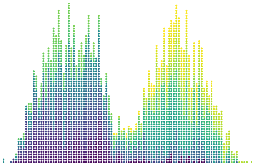
4. Prepare the static plot
Influenced by Bret Beheim’s visualizations with tweenr, I was looking for a plot with a similar aesthetic.
To do that, I have to
- Bucket the data into discrete bins (using
np.digitize) - Set a y-value for each data point. I just count upwards from 0 for each bin, then divide by the max, so I know it is between 0 and 1.
There is also a bunch of matplotlib styling at the bottom, to make everything look beautiful. I use the viridis color map to show which draw I am on. Later draws will be yellower.
hi, lo = samples.max(), samples.min()
x = np.linspace(lo, hi, 100)
bins = np.digitize(samples, x, right=True)

counter = np.zeros_like(bins)  # y values
counts = np.zeros_like(x)  # keep track of how points are already in each bin
for idx, bin_ in enumerate(bins):
    counts[bin_] += 1
    counter[idx] = counts[bin_]
counter = counter / counter.max()


# Mess with plot styles here, since it is cheaper than animating
fig, ax = plt.subplots(figsize=FIGSIZE)
ax.set_ylim(0, 1)
ax.set_xlim(bins.min(), bins.max())
ax.spines['right'].set_visible(False)
ax.spines['top'].set_visible(False)
ax.spines['left'].set_visible(False)

ax.set_xticks([])
ax.get_yaxis().set_visible(False)
cmap = plt.get_cmap('viridis')
colors = cmap(np.linspace(0, 1, bins.shape[0]))


ax.scatter(bins, counter, marker='.', facecolors=colors);
5. Make the animation
This is taken pretty directly from the matplotlib animation docs, but I am using scatter instead of plot so that I can change colors of already plotted points. This means in the update step, I use set_offsets instead of set_data.
The falling animation is done with the offset below. The y-axis goes from 0 to 1, and each step I add a new particle. If each particle moves δ each step, then after, 10 steps, the y positions of the first 10 particles will be:
y0 -> 1 - 10δ
y1 -> 1 - 9δ
y2 -> 1 - 8δ
...
until it reaches the true y position. If you scribble on some paper, you can convince yourself this is equivalent to something like (np.arange(n) - n) * δ, then taking the maximum of that and the true position.
fig, ax = plt.subplots(figsize=FIGSIZE)
xdata, ydata = [], []
ln = ax.scatter([], [], marker='.', animated=True)
cmap = plt.get_cmap('viridis')

def init():
    ax.set_xlim(bins.min(), bins.max())
    ax.set_ylim(0, 1)
    ax.spines['right'].set_visible(False)
    ax.spines['top'].set_visible(False)
    ax.spines['left'].set_visible(False)

    ax.set_xticks([])
    ax.get_yaxis().set_visible(False)
    return ln,

def update(idx):
    xdata.append(bins[idx])
    ydata.append(counter[idx])
    colors = cmap(np.linspace(0, 1, len(xdata)))
    offset = (np.arange(idx + 1) - idx + 49) / 50
    y = np.maximum(ydata, offset)
    ln.set_offsets(np.array([xdata, y]).T)
    ln.set_facecolors(colors)
    return ln,

anim = FuncAnimation(fig, update, frames=np.arange(bins.shape[0]),
                     init_func=init, blit=True, interval=20)
HTML(anim.to_html5_video())
6. Now implement a tiny fire hose animation
O… okay?