The goal of this post is to scare users away from using Metropolis-Hastings, in favor of the NUTS sampler. I also want to provide a concrete example of a model that fails with a Metropolis sampler.
I am using the model from a previous post. The details are interesting, but not that important, except that this is a hierarchical model. We will also just concentrate on two of the values from the model.
The takeaway points are:
- The NUTS sampler generates (effective) samples about 10,000 times as fast as Metropolis
- What does a bad trace actually look like?
- How far from 1 can a bad Gelman-Rubin statistic be?
- It is easy to compare two models
varnames=('pooled_rate', 'state_rate')


with car_model(miles_e6, fatalities) as nuts_model:
    nuts_trace = pm.sample(10000, njobs=4)

    Auto-assigning NUTS sampler...
    Initializing NUTS using jitter+adapt_diag...
    100%|██████████| 10500/10500 [00:39<00:00, 267.26it/s]


with car_model(miles_e6, fatalities) as metropolis_model:
    metropolis_trace = pm.sample(10000, step=pm.Metropolis(), njobs=4)

    100%|██████████| 10500/10500 [00:28<00:00, 372.62it/s]
How fast did we sample?
On my machine, the NUTS sampler took around 40 seconds to generate 10,000 samples, and the Metropolis sampler took around 30 seconds. But really, we should be looking at the effective sample size.
pm.effective_n(nuts_trace, varnames=varnames)

    {'pooled_rate': 40000.0,
     'state_rate': array([ 40000.,  40000.,  40000.,  40000.,  40000.,  40000.,  40000.,
             40000.,  40000.,  40000.,  40000.,  40000.,  40000.,  40000.,
             40000.,  40000.,  40000.,  40000.,  40000.,  40000.,  40000.,
             40000.,  40000.,  40000.,  40000.,  40000.,  40000.,  40000.,
             40000.,  40000.,  40000.,  40000.,  40000.,  40000.,  40000.,
             40000.,  40000.,  40000.,  40000.,  40000.,  40000.,  40000.,
             40000.,  40000.,  40000.,  40000.,  40000.,  40000.,  40000.,
             40000.,  40000.])}


pm.effective_n(metropolis_trace, varnames=varnames)

    {'pooled_rate': 3.0,
     'state_rate': array([ 13.,   2.,   6.,   5.,  29.,   8.,   7.,   6.,   2.,  45.,  48.,
             12.,   6.,  28.,   7.,   2.,   2.,   6.,  17.,   2.,   4.,  17.,
             10.,  11.,  12.,  13.,   2.,  12.,   2.,   7.,   5.,   4.,  35.,
             31.,   2.,  21.,   5.,   2.,  25.,   2.,   9.,   2.,  26.,  24.,
              2.,   2.,   2.,   8.,   2.,  10.,   2.])}
More is better here. We see that every sample from the NUTS was a good sample, but the Metropolis sampler only generated a few effective samples. Intuitively, this is because the Metropolis sampler produces draws that are highly correlated, and does not explore the space as efficiently as the NUTS sampler.
Most of what follows is morally related to this: any valid MCMC sampler will eventually produce samples according to the pdf, but “eventually” here is in the true mathematical sense, in that we may need to sample forever. In this example, the Metropolis sampler just did not generate many independent samples, so it is heavily biased towards its starting position.
Checking the trace
Now that we have some samples, checking pm.traceplot gives a picture of our histograms on the left, and a timeline of samples drawn on the right. The NUTS trace looks pretty good, and the Metropolis trace looks pretty bad.
pm.traceplot(nuts_trace, varnames=varnames)
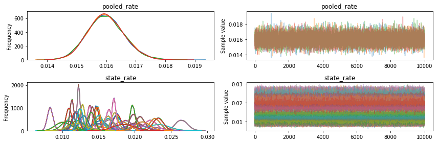
NUTS was doing great right from the start (pymc3 tunes for 500 steps): we could have taken only 500 or 1000 samples and still had a pretty good histogram.
pm.traceplot(metropolis_trace, varnames=varnames);
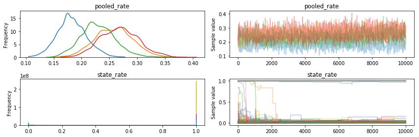
The Metropolis trace. You can see four different lines, because the four different jobs we ran produced different histograms, which is bad: you would hope that sampling from the same model four times would produce roughly the same results. Not only that, but the pooled rate is around 10x the correct value (0.016, from the NUTS trace). Also, you can see that the state rates got pretty stuck, and a few eventually dropped down to near 0, but some never did, staying near 1.0 the whole time.
Using statistical tests
In case we are not convinced yet that the NUTS trace did a great job of sampling, while the Metropolis one would give us wildly incorrect results, we can use the Gelman Rubin statistic, which compares between chain variance with inter chain variance. Intuitively, if each chain looks like each other chain, then it might have been a good draw, so the Gelman-Rubin statistic should be near 1. Here’s a bar plot of the state rate for the NUTS trace, and for the Metropolis trace.
The NUTS plot is, in the words of Abraham Simpson, like “a haircut you could set a watch to”. The Metropolis trace is, conversely, an apogee of sculpted sartorium, all over the place, and often nowhere close to 1.
nuts_gr = pm.gelman_rubin(nuts_trace, varnames=varnames)
metropolis_gr = pm.gelman_rubin(metropolis_trace, varnames=varnames)
fig, axs = plt.subplots(2, 1)
axs[0].bar(x=df.State, height=nuts_gr['state_rate']);
axs[1].bar(x=df.State, height=metropolis_gr['state_rate']);
#axs[1].set_yscale('log')
fig.set_size_inches(18.5, 10.5)
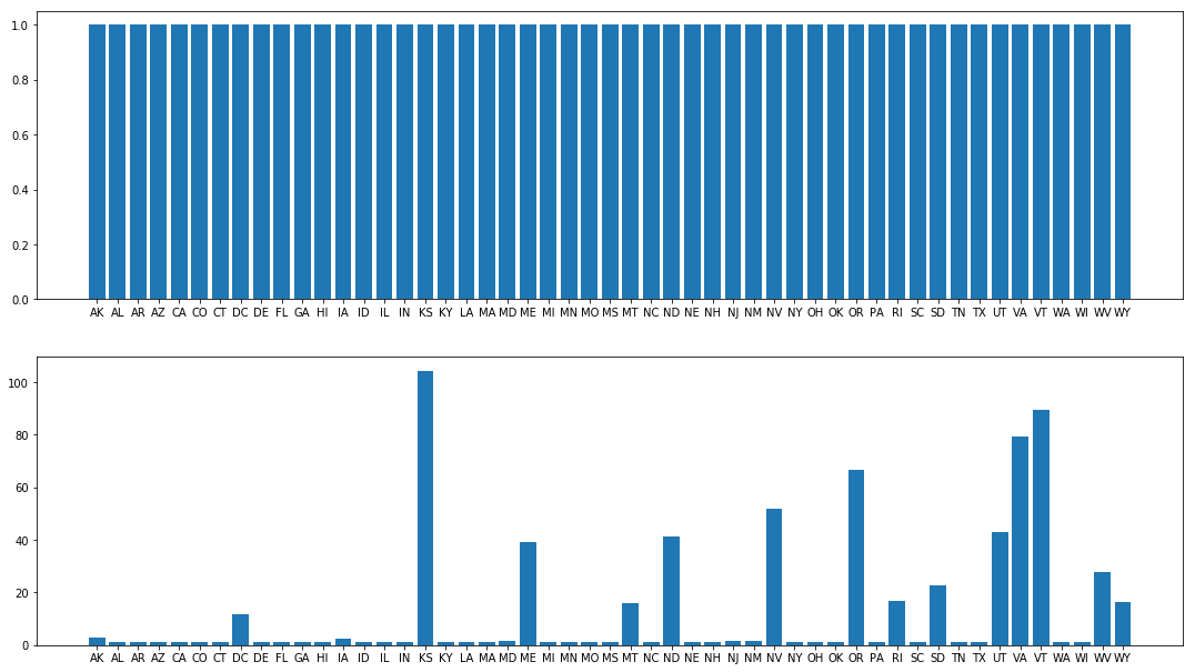
The Gelman-Rubin satistic for the state rates on the top (NUTS trace) are all near 1, which is good. On the bottom they are often far from 1, indicating that the Metropolis traces had not yet converged.
Finally, there is a nice “compare” function to compare how two models have fit. This is meant for more subtle work than this, but a lower WAIC is, roughly, better. The first row here is the trace from the NUTS model.
pm.compare([nuts_trace, metropolis_trace], [nuts_model, metropolis_model])
| WAIC | pWAIC | dWAIC | weight | SE | dSE | warning | |
|---|---|---|---|---|---|---|---|
| 0 | 498.99 | 25.5 | 0 | 1 | 12.19 | 0 | 1 |
| 1 | 3.1742e+09 | 1.5871e+09 | 3.1742e+09 | 0 | 1.83667e+09 | 1.83667e+09 | 1 |